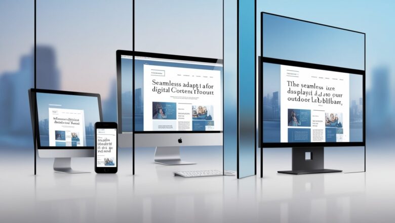
Mastering CSS Media Queries for a Responsive WordPress Layout
In the age of mobile browsing, ensuring your WordPress site has a **responsive layout** is crucial. One of the most effective ways to achieve this is through **CSS media queries**. This article will guide you on how to use media queries in WordPress, providing examples, best practices, and tips to optimize your layout for various devices.
Understanding CSS Media Queries
**CSS media queries** allow you to apply different styles based on the characteristics of the device displaying your site, such as screen width, resolution, and orientation. This capability is fundamental for creating a **mobile-friendly WordPress layout** that adapts seamlessly to all screen sizes.
How to Use Media Queries in WordPress
To implement media queries effectively, follow these steps:
1. **Identify Breakpoints**: Determine the widths where your layout needs adjustments. Common breakpoints include:
– 320px for mobile devices
– 768px for tablets
– 1024px for desktop
2. **Add Media Queries**: You can add your media queries in your theme’s CSS file or via the WordPress customizer under “Additional CSS.” Here’s a simple example:
@media (max-width: 768px) {
  body {
    background-color: lightblue;
  }
  .container {
    padding: 10px;
  }
}
WordPress CSS Media Query Examples
Here are some **WordPress CSS media query examples** to illustrate different use cases:
- **Adjusting Font Size**:

@media (max-width: 600px) {
  h1 {
    font-size: 1.5em;
  }
}
- **Changing Layout**:

@media (min-width: 768px) {
  .two-column {
    display: flex;
  }
}
- **Responsive Images**:

@media (max-width: 600px) {
  img {
    max-width: 100%;
    height: auto;
  }
}
WordPress Responsive Design Techniques
To create a successful **responsive design for WordPress websites**, consider the following techniques:
– **Fluid Grid Layouts**: Use percentage-based widths for elements to ensure they scale proportionately.
– **Flexible Images**: Ensure images resize with the browser by setting their max-width to 100%.
– **Responsive Navigation**: Implement a **WordPress responsive menu using media queries** to adapt your navigation for smaller screens.
Custom Media Queries for WordPress
Creating **custom media queries in WordPress** allows for specific styling that fits your theme. Use them to address unique design elements or features in your layout.
Best Practices for Media Queries in WordPress
Here are some **media query best practices** to follow:
1. **Organize Your CSS**: Group all media queries at the end of your stylesheet or next to the relevant styles for better maintainability.
2. **Mobile-First Approach**: Start with styles for mobile devices and use min-width in your media queries to enhance the layout for larger screens.
3. **Test Across Devices**: Regularly check how your site appears on various devices to ensure a consistent user experience.
Troubleshooting Media Queries in WordPress
If your media queries aren’t working as expected, consider these troubleshooting tips:
– **Check Specificity**: Ensure that your media query styles are not being overridden by other styles.
– **Inspect in Browser**: Use the browser’s developer tools to see how styles are applied and test different screen sizes.
– **Clear Caches**: If using caching plugins, clear the cache after making CSS changes.
Further information
To learn more about the CSS Media Queries have a look at the tutorial of W3Schools.
Conclusion
Utilizing **CSS media queries** is essential for optimizing your WordPress layout. By implementing responsive design techniques and adhering to best practices, you can create a versatile and user-friendly website. With the examples and guidelines provided, you’re well-equipped to enhance your WordPress site’s responsiveness and improve the overall user experience. Start applying these strategies today to create an engaging, responsive site that looks great on any device!
